Signup Flow Optimization Guide: Reduce Signup Friction Fast
Signup flow optimization: which fields to cut, which auth method to lead with, and where to place the paywall, based on Clerk's own sign-up data.
On this page
A signup flow is the sequence a new visitor completes to create an account, sitting between the landing page above it and the trial or onboarding experience after it. Signup flow optimization means deciding which fields to cut, which auth method to lead with, and where verification and the payment ask sit inside that sequence.
A widely repeated push tells teams to demote passwords below passkeys and magic links. Clerk's own sign-in numbers, published on Stripe's Atlas guide, say otherwise.
Clerk tracks more than 100 million account creations and logins across thousands of apps. On that data, password still beats email OTP, SMS OTP and magic link on speed.
Clerk's own sign-in data backs one side of the auth-stack argument, not the other, and two of the corpus's favorite numbers, a Chargebee case study and a completion-rate benchmark, don't survive opening their own source. The advice that holds up gets reconciled into rules below; the two numbers that don't get corrected instead of repeated.
Four adjacent decisions sit outside this guide's scope. Trial length and whether the trial requires a card up front belong to trial to paid conversion. What counts as an activated user belongs to user activation.
Getting a user to their first real outcome once they're inside the product belongs to time to value. Demo request and page level funnel work for B2B belongs to B2B conversion rate optimization. Once a guide to funnel-wide conversion work exists, where signup sits inside that broader funnel will belong there too.
Pair this with organic acquisition work: our SaaS SEO guide covers what brings a visitor to the form in the first place, and this guide starts once they've already clicked through.
In this guide:
- Which fields belong on a saas signup flow, and why B2B demo forms don't follow the same rule
- The auth stack order Clerk's own data actually supports
- When one step becomes two, with a worked before-and-after example
- Where to gate on email verification and where the payment ask belongs
- How to pick a signup flow to model, by one mechanism instead of a logo wall
- What a completion rate benchmark does and doesn't tell you
Signup flow optimization: what to cut, keep, and defer
Signup form fields fall into three tiers: email or phone plus password are essential, name is deferrable to a second step, and everything else is deferrable to onboarding. Cutting fields is the most common way teams try to reduce signup friction, and it only works when you cut the right fields.
| Tier | Fields | Ask it |
|---|---|---|
| Essential | Email or phone, password | Step one, before anything else |
| Often needed | Name | Step one or step two, never later |
| Deferrable | Company, role, team size, phone number | After account creation, inside onboarding |
On mobile, the same tiers apply, but each extra field costs more. Keep step one to two thumb-friendly fields, and use the device's own keyboard types: an email keyboard for email, a numeric pad for phone.
A one-line reason next to a field that asks for something personal, "used for account recovery only", removes hesitation without adding a field of its own.
That field-cutting rule is signup form optimization for a self-serve product. It doesn't transfer to every form type.
RevenueHero's own data on B2B demo-request forms found 77% conversion at 2 fields versus 76% at 13. Field count barely moves the needle there because a demo form has a downstream filter self-serve signup doesn't: a sales rep qualifies the lead after submission, so extra fields cost little.
Self-serve signup has no such filter. Every field you ask for either gets answered or costs you the signup outright. Demo request and page level B2B funnel work belongs to B2B conversion rate optimization; the field tiers above are for the step that creates an account directly.
Which auth methods to lead with
Google SSO earns the top slot in the auth stack by Clerk's own speed and adoption data, and password remains the correct universal fallback despite the passwordless-first advice circulating elsewhere.
| Order | Method | Why it ranks there |
|---|---|---|
| 1 | Google SSO | Fastest tier on Clerk's own ranking, and over 65% of users pick it when it's offered |
| 2 | Password | Beats email OTP, SMS OTP and magic link on Clerk's own speed data |
| 3 | Email OTP | Ahead of SMS OTP and magic link |
| 4 | SMS OTP | Ahead of magic link only |
| 5 | Magic link | Slowest of the six methods in Clerk's own ranking |
SAML SSO sits between Google SSO and password on that same speed ranking, but it's an enterprise-only option. Offer it to enterprise buyers alongside Google SSO, and skip it for the rest of your signup base. Other social logins, Facebook included, drop below the fold: adoption stays under 5% when they're offered, well behind Google SSO's 65%-plus.
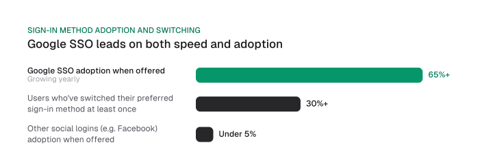
A passwordless-first push tells teams to lead with passkeys and magic links and treat passwords as a legacy option. Clerk's own ranking contradicts that: password beats email OTP, SMS OTP and magic link on speed.
Clerk's own tracking also shows more than 30% of users switch their preferred way to sign in at least once. On the sso vs email signup question, the data gives one clear answer: rank SSO first, and keep password as the fallback every email-based signup still needs.
Keeping magic link in the stack as a fallback, despite its last-place speed, is our own call here. It covers users who get locked out of their primary method, a real trade-off Clerk's dataset doesn't measure. The support-ticket cost of that fallback shows up in the FAQ below.
When you do ask for a password, show the requirements before the first attempt rather than after a failed submit, and let a password manager fill the field without a custom validation script fighting it.
Before you reorder your own auth stack, size the test properly. Follow a growth experiment cadence so a change in conversion reads as a real signal rather than noise from a small sample.
Single-step or multi-step, and what moves to step two
A signup form needs more than one step once it exceeds three or four fields or serves a segmented B2B audience, moving everything beyond email, password and name onto a later step or into onboarding.
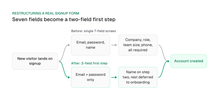
Take a real form through that restructuring. Before: a single screen asks for email, password, name, company, role, team size and phone, seven fields before the visitor sees any product.
After: step one asks only for email and password. Step two asks for name. Company, role and phone move to a day-three onboarding question, once the account already exists and the visitor has a reason to answer them.
The same logic applies even when a form is short. A segmented B2B audience, one where a small-team buyer and an enterprise buyer need different next steps, benefits from a second step even at three fields. Split by company size or role there, and route each visitor to the onboarding path that matches them.
Where to put email verification and the payment ask
Email verification belongs after instant product access by default, gated only by a named exception, and paywall placement follows one of three named patterns chosen by business model.
Three named patterns from CXL's own research cover most of the options. MailChimp asks for full signup details and verifies before granting any access. Chargebee asks for email only and grants access before verification. Typeform grants real product access before making any signup ask at all.
These patterns come from CXL's 2016 write-up of three real flows. Treat the pattern each one represents as durable; the exact screens have likely changed since.
| Pattern | When it verifies | Use it when |
|---|---|---|
| MailChimp | Before access | Compliance or spam-risk rules require it up front |
| Chargebee | After access, email only up front | You're testing a lower-friction default for a self-serve product |
| Typeform | Never before access | The product itself works as the demo |
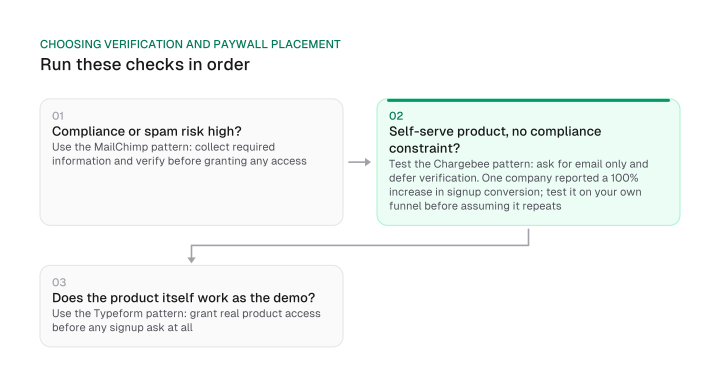
Chargebee's own case study reports one company's result. Its blog credits a 100% increase, a doubling, in signup conversion after switching to single-field email signup with deferred verification.
Test the access-then-verify pattern on your own funnel before assuming it will double your numbers too.
A second Chargebee number gets misattributed even more often. Some retellings credit an 8% to 15% lead-to-paid lift to the single industry-selection question asked at signup.
Chargebee's own blog credits a broader "Common Conversion Activities" program for that lift. That program spans several signup and onboarding changes together, well beyond the single field some retellings point to.
Once verification and the payment ask are placed, the confirmation screen still matters. Tell the visitor exactly what happens next, whether that's product access, a verification email, or a card form, so the moment right after signup doesn't feel like a dead end.
Where the card ask sits relative to signup is this guide's territory. Trial length and what happens once a trial actually starts belong to trial to paid conversion instead.
Signup flow examples worth modeling
Eleven named signup flow examples across three separate rosters sort cleanly onto one axis: whether the product is visible before or after the password step.
Run your own form through the same test. List what a visitor actually sees right before they hit a password field, a blank screen, a marketing page, or the live product, and compare that against the eleven examples below to find the closest match.
| Example | Source | Product visible before password |
|---|---|---|
| Chargebee, 2016 flow | CXL | Yes |
| Typeform | CXL | Yes |
| Rive | Userpilot | Yes |
| Miro | Userpilot | Yes |
| Stytch | Userpilot | Yes |
| ClickUp | Userpilot | Yes |
| MailChimp | CXL | No |
| Asana | Userpilot | No |
| Lovable | Userpilot | No |
| Headspace | Headspace's own site | No |
| Jotform | Jotform's own site | No |
Six show the product before any password ask: Chargebee's 2016 flow and Typeform, per CXL, and Userpilot's Rive, Miro, Stytch and ClickUp. Five ask for the full signup first: CXL's MailChimp and Userpilot's Asana and Lovable.
Headspace and Jotform belong in that second group too. Both are verified directly against their own live pages rather than a third party's summary of them.
None of the three source pages sorts its own roster this way, and none crosses it against the other two. What a visitor sees right before the password field decides the match, more than company size or industry ever will.
Is your signup flow actually working?
Clerk's 70%-completion benchmark measures one event: how many visitors who start the form finish it. Clerk's own guidance puts the signup completion rate at 70% or higher, start to account creation, as healthy, and a rate that regularly falls below that points to a stuck step in the form.
A rising completion rate right after a field cut can look like a win and still be a warning sign. Cutting a field can shift who completes the form and how many people do, two different things a single completion rate number can't separate. Product usage and speed to a real outcome, once a visitor is past this step, run through user activation and time to value.
Three checks catch a false read:
- Compare week-one product usage for the cohort before the change against the cohort after it.
- Split by acquisition channel, since a field cut can shift which channels convert best.
- Give the number four weeks before crediting the change; a seasonal swing can look identical over a shorter window.
Track signup completion the same disciplined way you track your SEO KPIs: as one number in a sequence, watched alongside the events on either side of it.
Put together, the fixes here are specific: reorder your auth stack behind Google SSO and password, defer the fields your onboarding flow can ask for later, and pick a verification and paywall pattern that matches your business model instead of a screenshot. Start with the auth stack. It's the one change here that over 100 million of Clerk's own sign-ups and sign-ins already back.
Frequently asked questions
Does removing the password field actually remove its friction, or just move the cost?
It moves the cost. Magic-link deliverability failures and lost-device account recovery both turn into support tickets instead of signup friction. Track your support team's ticket volume for four weeks after the change, since your completion rate won't show you this trade-off at all.
What is the goal of a SaaS signup flow?
A SaaS signup flow's goal is routing a new user to a real product outcome inside their first session. Form completion is a step on that path: a form that completes at a high rate still fails its job if it sends unqualified users into a product they abandon within a week.
What should you ship on your signup form this quarter?
Start with three changes: reorder your auth stack behind Google SSO and password, move deferrable fields (company, role, team size, phone) out of step one, and pick a verification and paywall pattern that matches your business model. Each change traces to Clerk's or CXL's own published data.
What are signup forms, and is that the same thing as a signup flow?
Signup forms, as usually discussed online, are marketing lead-gen and newsletter opt-in forms, a different topic from the product account-creation flow covered here. The two share a name and little else: one collects an email for a mailing list, and the other creates a paying customer's account.
Figures and images in this post are free to reuse under CC BY 4.0 with credit to Mission Growth.
Get Mission Growth highlighted in your Google results.